


Websites
Terrazza Campailla: a website for baroque Modica, as a barter
Analysis, four clickable design proposals and the new website, in Italian and English, for a holiday rental in the historic centre of Modica. Made with the Settimana del Baratto: the website in exchange for hospitality.

-
pages of analysis
-
design proposals
-
Lighthouse mobile, from 57
-
SEO on Lighthouse
In summary
In brief
- Terrazza Campailla has five themed rooms and a sun terrace in the baroque historic centre of Modica, a UNESCO World Heritage Site. Guests rate it 9.6 out of 10 across more than a hundred reviews.
- The old site didn't say where the property was, didn't show the reviews, was only in Italian and sent visitors' data to Facebook without consent.
- The work came about through the Settimana del Baratto: the rebuild of the website in exchange for nights in Modica, put in writing in a service exchange agreement.
- First a 13-page analysis, then four clickable design proposals, finally the site in Elementor 4 with the English version, GDPR compliance, SEO and GEO.
- Lighthouse mobile from 57 to 77, SEO from 92 to 100, home page weight from 5.5 to 2.1 MB. Live since 26 October 2026.
An award-winning property, a website that didn't say so
Terrazza Campailla has five themed rooms and a sun terrace in the baroque heart of Modica, sixty metres from Piazza Matteotti and Corso Umberto: the UNESCO World Heritage Modica of chocolate and of the churches of San Giorgio and San Pietro. Guests rate it 9.6 out of 10 across more than a hundred reviews, and Booking has given it three Traveller Review Awards (2024, 2025, 2026).
Yet the website said none of this. It didn’t say where the property was, didn’t show the reviews, couldn’t be called with one tap from a phone, was only in Italian and sent visitors’ data to Facebook without asking for consent.
A barter, with the Settimana del Baratto
The work came about through the Settimana del Baratto, the initiative that puts hospitality businesses in touch with people who offer goods or services in exchange for a stay. No invoice and no quote in money: the rebuild of the website in exchange for nights in Modica.
The barter was put in black and white in a service exchange agreement, an atypical contract (art. 1322 of the Italian Civil Code) with the analysis attached: both sides know exactly what is being done and what they get in return. Working from Abruzzo for a property in Sicily came with a precise constraint: everything the site says about Modica (distances, parking, what to see) had to be true and verifiable, because I couldn’t go and check it in person before delivery.
The analysis: understand before designing
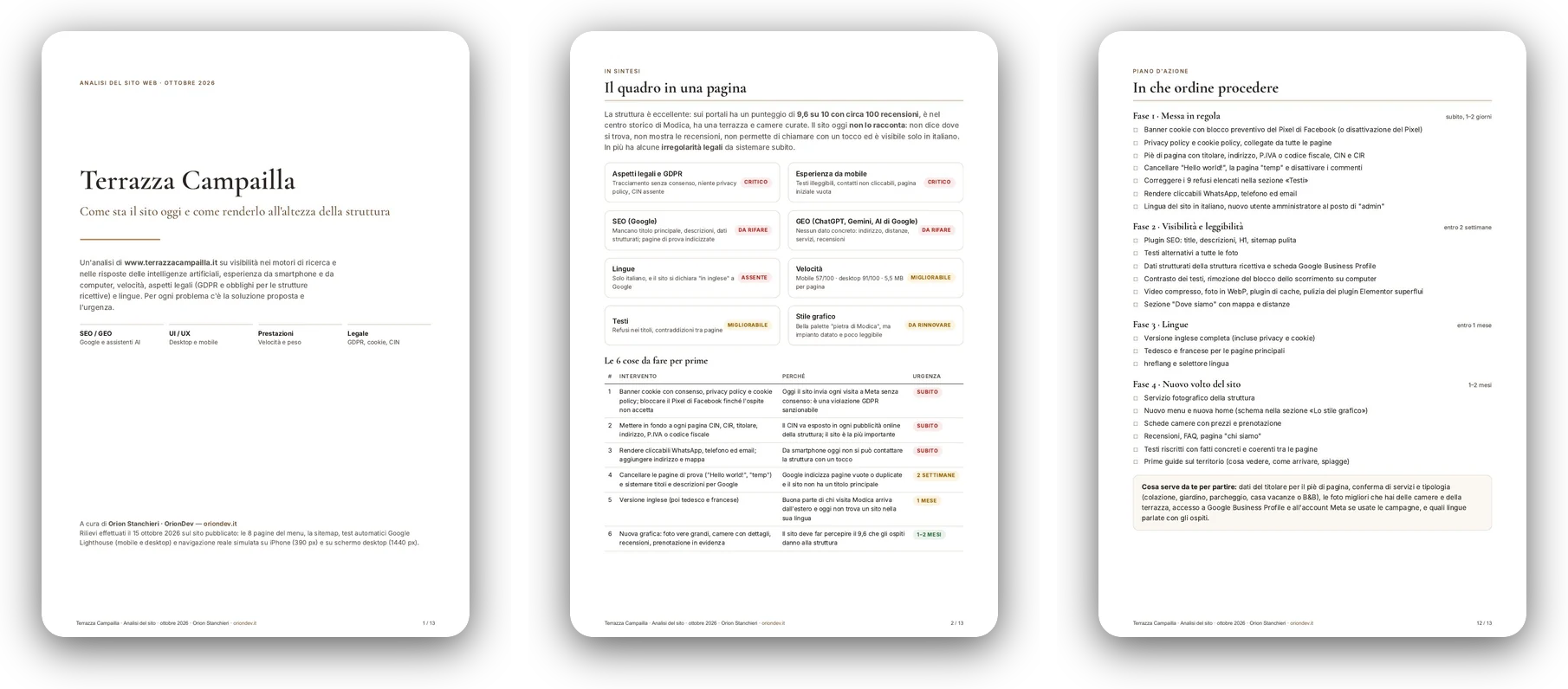
The first step was a thirteen-page analysis, delivered to the owner on 15 October 2026. To write it I checked the eight menu pages and the sitemap, ran Lighthouse tests on mobile and desktop and browsed the site as a guest would, on a simulated iPhone and on a 1440-pixel screen.
It is written for whoever runs the property, not for a technician: each problem has an urgency level, a plain-language explanation and the proposed fix. It covers seven areas. Legal: the Meta Pixel running without consent, no privacy or cookie policy, CIN and CIR not displayed. Mobile: contacts not clickable, no address or map, white text on sand with a contrast of 1.85 to 1. Texts: nine typos in the headings. SEO: no H1, no meta description, the language declared as English, none of the 32 images with alt text. GEO: no concrete fact that ChatGPT, Gemini or Google’s AI Overviews could quote. Performance: 57 out of 100 on mobile and 5.5 MB per page, 72% of it a background video. Style: there was an identity, the colours of Modica stone, but the layout was dated. The four-phase action plan then became the annex to the agreement.


Four proposals, four local materials
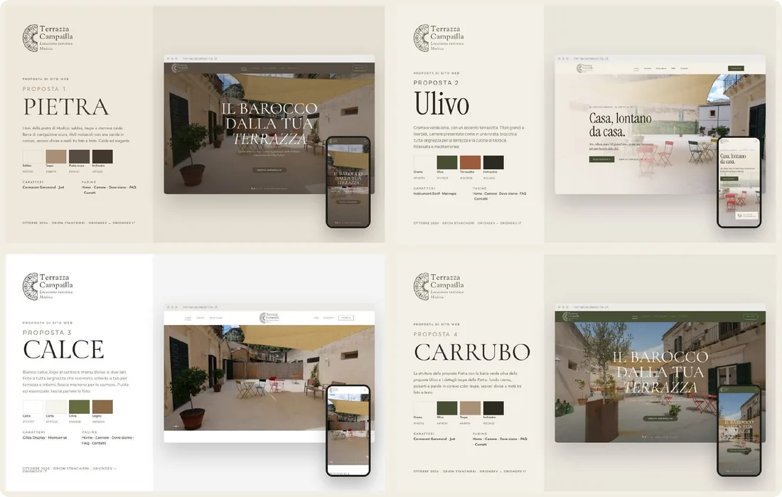
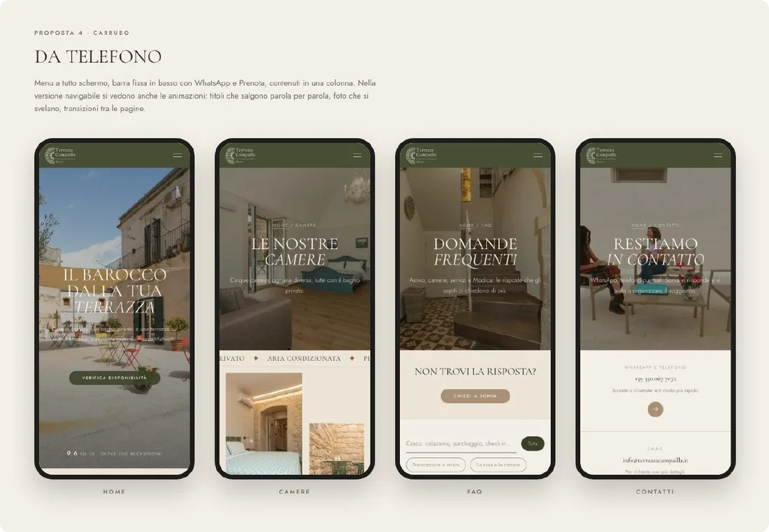
The analysis led to four directions, each named after a local material: Pietra, the limestone of Modica, warm tones and capital-letter headings; Ulivo, the olive tree, cream and olive green with a terracotta accent; Calce, the lime of the walls, white, with the logo in the centre and full-width photos; Carrubo, the carob tree of the Iblei hills, the structure of Pietra with the green of Ulivo.
They weren’t static sketches. Each proposal is a five-page clickable HTML prototype (home, rooms, location, FAQ, contacts), with animations and a phone version, generated by a single Python script. The real content, that is the rooms with their story, the FAQ, the distances and the reviews, lives in the script only once: correcting a fact corrected it in all four proposals. A PDF was then made from each prototype to send to the owner.
The choice: Carrubo
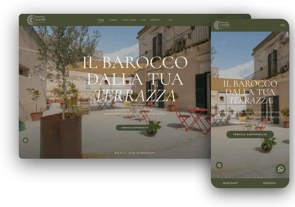
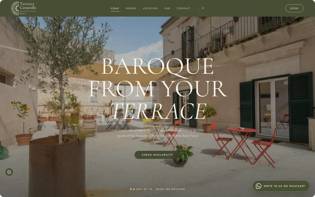
The owner chose the fourth proposal, Carrubo: Cormorant Garamond for headings, Jost for body text, olive green for the bar and buttons, and the title «Baroque from your terrace» over the real photo of the terrace.
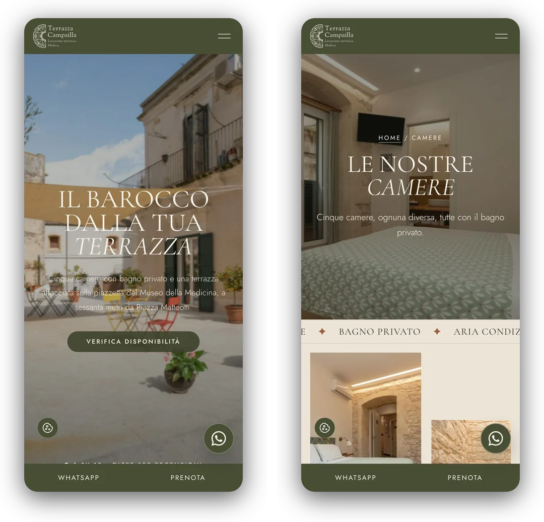
On the phone a fixed bar at the bottom keeps WhatsApp and Book where the thumb lands, and the content flows in a single column, with the same transitions as on the computer.


The site, in Elementor 4
The chosen proposal was rebuilt in Elementor 4 with atomic elements: global classes and variables hold all the styling, so colours, fonts and spacing change from a single place, and the owner can edit the texts from the usual visual editor without touching code.
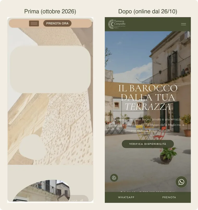
Here, the home page on an iPhone, before and after: on the left the old one, as documented in the analysis, with two empty boxes, no logo and no title; on the right the new one. The home page follows the outline proposed in the analysis: the terrace full screen, the rating right below the title, the rooms, a continuously scrolling photo gallery, the Booking awards in a slider, the historic centre, the FAQ, a section for newlyweds and a form that opens a WhatsApp chat already filled in with dates and number of guests.
Five rooms, each with its own story
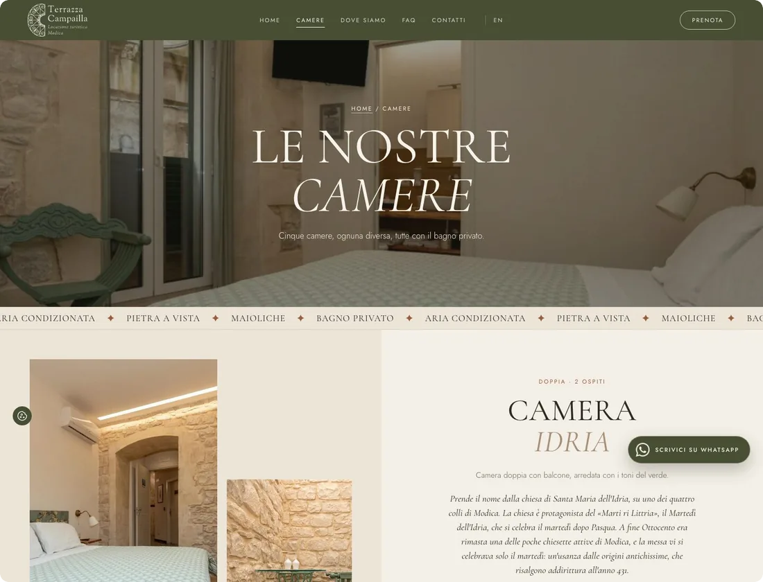
Idria, Torre d’Oriente, Amore Vero, Ciarciolo and Castello are named after places in Modica: the church of the Idria and its «Marti ri Littria», the «Dente» quarter, from Urienti, that is Orient, the staircase of via Amore Vero, the hamlet of Marina di Modica. Each room page tells that story, as well as beds, amenities and capacity.
Where we are: Modica, in concrete terms
The Location page opens with a timelapse of San Pietro from day to night. The 4K original weighed 82 MB, the one on the page 1.2 MB, and it plays on its own on iPhone too. Then come how to get there without stairs, walking distances to the monuments and the section «Baroque, chocolate and the sea», where I kept only verifiable facts (UNESCO 2002, the 1693 earthquake, PGI chocolate, Marina di Modica about 20 km away) and dropped those from the old site that didn’t stand up to a check.
The FAQ answers nineteen real questions from guests. The most important is «Where do I leave the car?»: «parking Modica historic centre» is among the Google searches that concern the property most.
On the phone, one tap away
On the phone the fixed bar at the bottom always keeps WhatsApp and Book within reach, and the WhatsApp button floats over the page. Phone, email and address open with a tap: on the old site they had to be copied by hand.
In English too, error page included
Many of the people who visit Modica come from abroad. I added the English version with Polylang under /en/, with a twin for every page, header and footer included, hreflang, and titles and descriptions for Google in both languages.
The 404 page has the site’s style too, with Modica by night. The same goes for the pages WordPress shows during updates or when the database doesn’t respond: they are written in plain PHP, because they have to work even when WordPress won’t start.
Compliant, and quotable by AI
The cookie banner asks for consent first: the Meta Pixel and Google tags only fire after «Accept». Checked in a clean browser: before choosing and after «Reject», zero requests to third-party services. There are privacy and cookie policies listing the cookies actually observed on the site, CIN and CIR in the footer of every page as required by art. 13-ter of Decree-Law 145/2023, and fonts served by the site rather than by Google.
For SEO: titles, descriptions and sharing images for every page, a single H1, the correct language, alt text for the photos, and 301 redirects from every address of the old site. The keywords come from Google’s suggestions, with one legal constraint: the property is a holiday rental and not a B&B, so «B&B» is not in the titles, even though it’s the most frequent search. For GEO: LodgingBusiness and FAQPage structured data, and an llms.txt file with the main facts in plain text, so that ChatGPT, Perplexity and AI Overviews quote the property with the right data.
The numbers, before and after
Google Lighthouse measurements of the home page, on 15 and 30 October 2026. On mobile, performance goes from 57 to 77, first contentful paint from 4.1 to 1.8 seconds, largest contentful paint from 9.0 to 5.2 seconds, layout shift from 0.14 to 0.02, and weight from 5.5 to 2.1 MB. SEO goes from 92 to 100.
On desktop, performance drops instead from 91 to 87, because the new home page has many more real photos of the property: the gallery, the rooms, the awards, the weddings. The next step is caching: every page opens a PHP session, so the host’s cache never kicks in.
How I worked
The site was already live, with no test environment and no SSH access, on shared hosting, and other people were working on it at the same time. So: a backup before every change, with a log of what changed and how to undo it; changes through the REST API and FTPS with repeatable scripts; Elementor pages built with Claude Code and the Elementor MCP, comparing the draft with the published version every time; custom code (GSAP animations, the continuously scrolling gallery) in WPCode, where the owner can read it and switch it off from the dashboard; every change checked on the live site, as a visitor, on desktop and on iPhone.
Revisions went through WhatsApp: a photo to replace because the garage showed, the 2025 award to add, and above all one request, not to repeat the same photos in different parts of the site. To honour it I compared the photos with a visual fingerprint, so as to catch identical shots saved under different names too. In the end the site uses more than fifty different photos, and the only ones that repeat are the logo and the award badges.
Need something similar? This project is an example of custom website design. The first meeting and the quote are free: write to me and let’s talk.
The package
What was delivered
- 13-page website analysis, with an action plan
- Four clickable design proposals, with PDFs
- Site in Elementor 4 with atomic elements
- English version with Polylang
- Cookie banner, privacy and cookie policy, CIN and CIR
- SEO, structured data and llms.txt for GEO
- 301 redirects from the old site
- Custom 404 page and maintenance pages
- GSAP animations and gallery in WPCode
In detail
Technical details
- Platform: WordPress with Elementor 4, in Italian and English
- Year: 2026
- Status: In production
- Technologies: WordPress, Elementor, GSAP, Polylang, Rank Math, WPCode, Python, SEO
The images come from the analysis, the design proposals and the live site. Lighthouse measurements of 15 and 30 October 2026.
Let's talk
Need a website like this?
If you have a property guests reward and a website that doesn’t say so, write to me: we start from a plain-language analysis and decide together what to do from there.