



Websites
L'Ora del Tempo: the showcase of a vintage watch collector
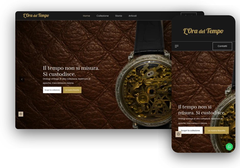
Visual identity, photography and website for a collection of high-end watches that can’t be bought with a click: every piece is negotiated in person, and the site takes the visitor all the way to that conversation.
-
watches on display
-
collections
-
brands in the catalogue
-
public prices
In summary
In brief
- The collection of a watchmaking enthusiast from the province of Teramo: Patek Philippe, Vacheron Constantin, Audemars Piguet, Zenith, Breitling, Gérald Genta and other historic brands.
- The watches have no public price and can't be bought with a click: every piece is negotiated in person, through direct and confidential contact.
- Before designing anything I went with the client to a real watch resale fair, to understand how to talk to the people who buy these objects.
- I handled everything: logo and variants, palette, photo shoot, retouching and cut-outs, graphic compositions, design and development of the site.
- The site uses WooCommerce in showcase mode: no cart, no payment, and instead of the price a form and a WhatsApp button that already know which watch the visitor is asking about.
A collection you don't buy with a click
L’Ora del Tempo is the collection of a watchmaking enthusiast: almost a hundred pieces including Patek Philippe, Vacheron Constantin, Audemars Piguet, Zenith, Breitling, Gérald Genta and other historic brands. It isn’t a shop like any other: the watches have no public price and can’t be bought with a click. Every piece is negotiated in person, through direct and confidential contact.
That was the whole challenge. The site needed the care of a gallery rather than the look of an e-commerce store, while still leading the visitor, page after page, to write to the collector.
Before the site, a fair
To get to the heart of the project I didn’t stop at catalogues and industry websites: I went with the client to a real watch resale fair. Stalls, magnifying loupes, collectors turning a watch between their fingers, dealers who know when to speak and when to wait.
I wanted to understand the right way to communicate with the people who buy these objects: what a collector asks even before the price, which details really matter, what tone people use to talk about them. That is where the tone of the site comes from, along with product pages that tell the reference, calibre, materials and history of every piece, and the choice to lead every visitor to a conversation, just like at the stall.
A logo that observes time with precision
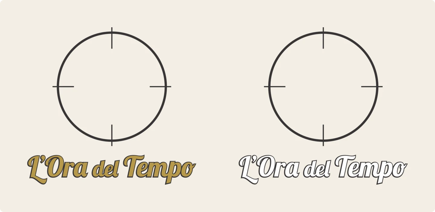
I designed the logo starting from the idea of time as something to be observed with precision: a dial reduced to its essentials, with four marks that recall a viewfinder, and below it a cursive lettering in antique gold that echoes the signs of old watchmakers’ shops.
The mark comes in about ten variants: in colour, positive and negative, with and without shadow, horizontal and wordmark only. That way it works on the site’s dark header, on letterheads and on social media. The palette follows the product: black and anthracite like the velvet of a display case, gold and amber like the cases and indices, the warm white of the dials.


Photographs, shot and retouched one by one
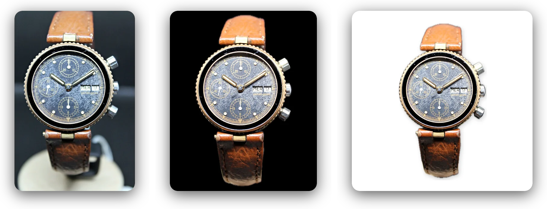
I photographed the watches myself, on set, with a Canon DSLR. A vintage watch is a hard object to photograph: glossy surfaces that reflect everything, dials with a patina that has to be shown and not hidden, details a few millimetres wide.
Then post-production, shot by shot: white balance, levels measured on the watch, shadows lifted just enough, local contrast and sharpening so that engravings and numerals can be read. The main catalogue photos are cut out, so they can be used on different backgrounds with the same watch. Here, the Gérald Genta Gefica Safari: the shot on set, the cut-out version on black for the product page, and the one on a white background with a contact shadow.
Each watch on its own material
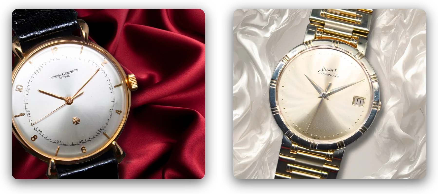
For the home page, the slider and the collections I created compositions in which each watch rests on a material that tells its character: leather for the skeleton watch, red satin for the rose gold Vacheron Constantin, white silk for the steel and gold Piaget.
These are images made for the site, not recycled catalogue shots: they give each collection its own atmosphere before a single line is read.


The home page: atmosphere first, then the catalogue
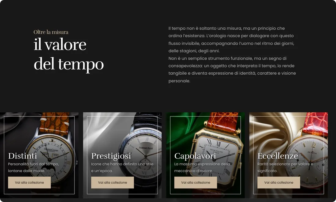
The home page opens on a full-screen slider with the claim «Time is not measured. It is kept.», then presents the four collections (Distinti, Prestigiosi, Capolavori, Eccellenze), the collector’s story, a strip with the brands in the collection, featured pieces and a contact form.
On opening, an animated preloader shows an amber dial on a black background. Visitors who want to can switch on the audio and hear the ticking of a watch as they browse. It’s a small detail, but it immediately puts the visitor in the rhythm of the collection. Both the preloader and the audio are custom-written in HTML, CSS and JavaScript.
A catalogue without a cart
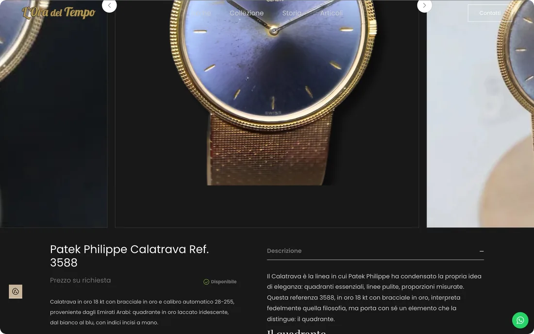
The catalogue runs on WooCommerce, but in showcase mode: no cart, no payment, no price. Each watch has its own photo gallery, a description with reference, calibre, materials and history, and instead of the price the words «Price on request».
Below each product page there are two ways to get in touch: an enquiry form that fills in the subject with the name of the watch on its own, so the collector knows straight away which piece it is about, and a WhatsApp button that opens the chat with a ready-made message and the name of the watch. Both features are customisations of the WooCommerce and Contact Form 7 code.
Designed for phones too
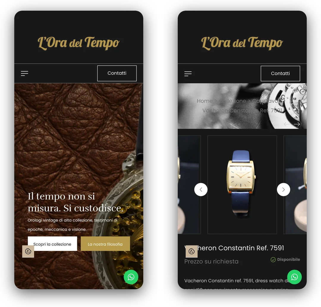
The site is designed for smartphones too, where WhatsApp is within thumb’s reach: anyone looking at a watch on their phone is one tap away from the collector, with the name of the piece already written in the message.
The work after launch
The work did not stop at launch. In 2026 I took care of the site’s maintenance: WebP images served automatically to browsers, with much lighter pages; a faster preloader, and audio that downloads only if the visitor turns it on; sitemap and technical SEO put back in order, so that Google finds every product page.
On top of that, the interface fully translated into Italian, the collections reorganised, the texts proofread, and a cookie banner and Cookie Policy compliant with the GDPR.
Need something similar? This project is an example of custom website design. The first meeting and the quote are free: write to me and let’s talk.
The package
What was delivered
- Logo in about ten variants, colour palette
- Catalogue photo shoot
- Photo retouching and cut-outs
- Graphic compositions for home page, slider and collections
- WordPress site built with Elementor
- WooCommerce in showcase mode, with no cart and no prices
- Enquiry form with automatic subject and WhatsApp with a prefilled message
- Custom preloader and audio
- 2026 maintenance: WebP, technical SEO, cookies
In detail
Technical details
- Platform: WordPress with WooCommerce in showcase mode
- Year: 2025
- Status: In production
- Technologies: WordPress, WooCommerce, Elementor, Contact Form 7, JavaScript, CSS, Canva, Photography
The images come from the live site and from the catalogue photo shoot. Figures recorded in October 2026.
Let's talk
Need a website like this?
If your business deserves a carefully crafted showcase rather than a shop like any other, tell me about it: we start from how your customers talk, and build the site from there.